
A design pattern is a way a problem is solved most of the time, avoiding the need to re-invent the wheel. As a UX designer, I resort to these patterns frequently when designing interfaces. When the entire world is using a feature in a certain way, changing it usually means the users won’t know how to use it. That’s why different behaviors of a recognized component tend to create friction. E.g.: “A dropdown list that is also a carousel?” - I probably wouldn’t go there… Bad usage of design patterns creates bizarre components. When a new feature is widely well used in the same way in several places, that usually creates a pattern.
While developing, it’s important to know how a component should behave, to guarantee the patterns will work well. We even have to look to the component libraries critically, because sometimes even those behaviors are not according the design patterns or are made so generic that the developer can implement it the wrong way.
The naming problem
I’ve heard “dropdown lists” being called “comboboxes”, “tooltips” called “modals”,“checkboxes” called “twinkles”, “buttons” called “icons”, “radiobuttons” called “checkboxes”… and so on. Sometimes that difference is due to the name the client recognizes that pattern by or the name the developer calls the component on the library which is different from the name the designer knows the component by as a pattern. Sure, a combobox may be coded as a dropdown list, but they are different design patterns and should behave differently. When, in doubt, check a design pattern library to see how the component should behave or get advice from someone who understands design patterns.
Best practices
Giving the correct behavior to a component is not enough. A good combination of components makes the interfaces work smooth and fine. A UX designer nearby is always a good help when you’re trying to make those choices. Without one, it’s very easy to get on the wrong path. (At Runtime Revolution we have a great design team that can help!)
I will list some tips I know a lot of interfaces out there could benefit:
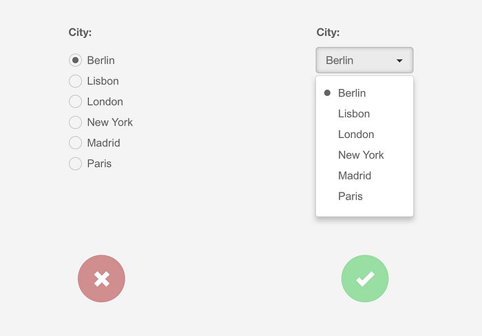
1. Default values everywhere
Use default values wherever you can. At least some of the users will already have their option selected. Worst case scenario the user will change it: something that would happen anyway if you leave the fields empty.
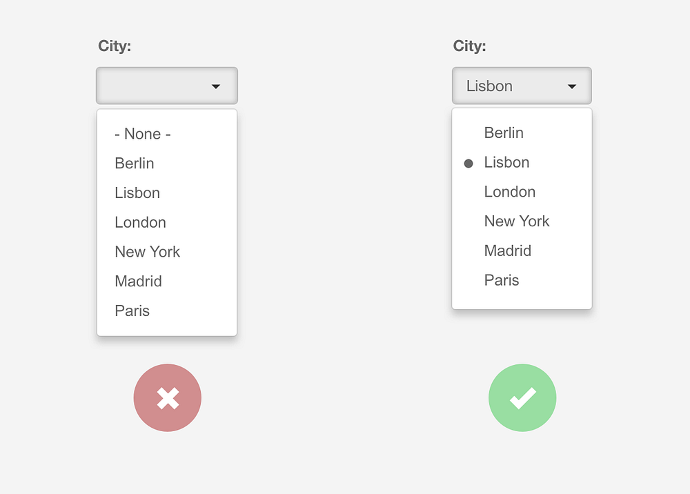
It’s also good practice to show the selected option inside the dropdown list.
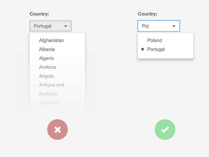
When it isn’t possible to have a default value, leave an input prompt, instead of a blank field, as seen below.

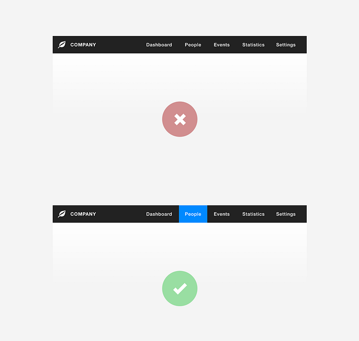
2. Always make sure the users know where they are
Users get lost frequently. The selected menu item should be easy to find.
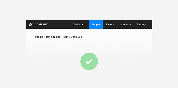
Use breadcrumbs in interfaces with a lot of pages where it’s easy to get lost.
3. Components to scale
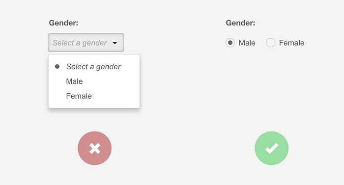
When you have a field that requires 2 exclusive options, radio-buttons may be the best component to use.
When you scale to, let’s say, more than 5 options in a form item, maybe your best shot would be a dropdown list.
And what about when that dropdown list has 50 options? Perhaps it’s better to use a combobox to quickly reach the correct option. Or, if you go with the dropdown list approach, make sure the user can type the word to quickly position himself in the correct option.
When you have a type of field that is predicted to scale over time, it should be designed for the current scenario, but built to scale.
4. Lists and numbers
Numbers in a list are far easier to read when they are aligned to the right, however, text should remain to the left. Aligning those items differently will help with readability.
Just see for yourself:
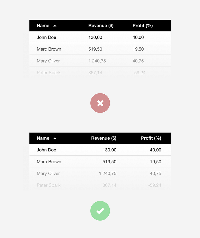
And, by the way, don’t forget to indicate the sorting column.
5. Scaling numbers
When you are dealing with data that you know can grow to thousands and millions, prepare the numbers to scale. What does that mean? It means you should avoid having big numbers like this:
2.112.123 (Try to read this number out loud)
Isn’t this better?:
2,1kk
When dealing with accurate measures, you may have to go with the extended number, but I believe most of the time, the users will probably only want to have an idea of the number. Scaling numbers saves a lot of space on the interface and helps with readability.
6. Infinite scrolling and footers
Don’t ever mix those two. Ever! If you are trying to reach the footer and you have an infinite scrolling page, it will just be a frustrating task. I like infinite scrolling for a lot of situations, but forget the footer there. If you need to have a footer, use the paging solution instead or put a “More” button at the end of the first loading.
7. Check design patterns’ sources
Here are some of my currently preferred design pattern sources when I have doubts as to what the most appropriate behavior for a component is, or even when I’m just seeking some inspiration:
Design patternsIt has long been common practice in software design to use libraries of recurring solutions to solve common problems in…ui-patterns.com Interaction Design Pattern Library - Welie.comInteraction Design pattern library. More than 120 patterns for web designers. All patterns include examples…www.welie.com Design PttrnsCheck out the finest collection of design patterns, resources, mobile apps and inspirationwww.pttrns.com Mobile PatternsA library of iOS and Android screenshots for designers and developers to reference.www.mobile-patterns.comI hope these tools and tips will help you to improve your products’ user experience a little more. You can find a lot more design pattern libraries out there if you’re interested in it and are willing to dig a little bit more into it. These are the ones that I use the most, but feel free to add more in the comments and contribute with your experience on fixing some of the most common mistakes of design patterns usage.
Do you have any comments or feedback on this subject? We’d love to hear from you!
At Runtime Revolution we care about the user experience. We are a team of designers and developers willing to make your ideas a success.
Runtime RevolutionWe are Rails, mobile and product development experts. We can build your product or work with you on your project.runtime-revolution.com